|
Massimo Tessitori
|
 |
« on: July 23, 2018, 10:32:06 PM » |
|
Hi all Hi Massimo! Can I ask you to please create a title plate for my site ava.org.ru (like wio.ru have http://wio.ru/my/wio.png maade by A.Kazakov) ? I'm not an artist myself... Preferred bilangual text is "Полки и самолёты"+"Units and planes". I haven't an idea about a background yet... Vlad As you can read, I was asked to create a banner for the site of Vlad. My first attempt is here: 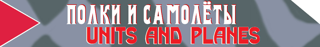 It is vaguely inspired to the La-7 of Kozhedub. I would like to read comments, suggestions and eventual alternative proposals for this thing by anyone. Regards Massimo |
|
|
|
|
 Logged
|
|
|
|
|
PG monster
|
|
« Reply #1 on: July 24, 2018, 03:04:55 PM » |
|
Good idea,
Please try to do :
1. Make english text twice smaller
2. Add latewar red star to the right side of the banner (so need to move the text to left)
Also, perhaps green-blue scheme will looks better? What about to leave Kozhedub plane and get most common triple red or white stripes (diagonal at the upper right corner? or vertical ones to divide text and the red star?)
|
|
|
|
|
Logged
|
|
|
|
|
Massimo Tessitori
|
|
« Reply #2 on: July 24, 2018, 05:52:48 PM » |
|
Hi, do you like this more? I could make green/blue livery, of course, but it was very rare at the end of the war. Eventually I could make some light blue under the star and stripes  Regards Massimo |
|
|
|
|
Logged
|
|
|
|
|
PG monster
|
|
« Reply #3 on: July 25, 2018, 09:34:35 AM » |
|
Hi, yes I like it more! Tripled lines gives an idea  Next steps: 1. Lets try to remove text's shadows (different directions and unusual in GPW). 2. Remove the red trianlgle (it looks great at the La-7, but not here). 3. Shift the star to the triangle's place (I mean the left side). 4. Center the texts back. Thank you |
|
|
|
|
Logged
|
|
|
|
|
Massimo Tessitori
|
|
« Reply #4 on: July 25, 2018, 09:50:22 AM » |
|
Hi, what about this one?  Regards Massimo |
|
|
|
|
Logged
|
|
|
|
|
PG monster
|
|
« Reply #5 on: July 25, 2018, 12:19:19 PM » |
|
Almost perfect!
Please shift the star righter a bit (center the star on the empty space of the left side)
and shiht the text lower (Ё char is too close to the border)
|
|
|
|
|
Logged
|
|
|
|
|
Massimo Tessitori
|
|
« Reply #6 on: July 25, 2018, 01:55:30 PM » |
|
Hi, is it ok? 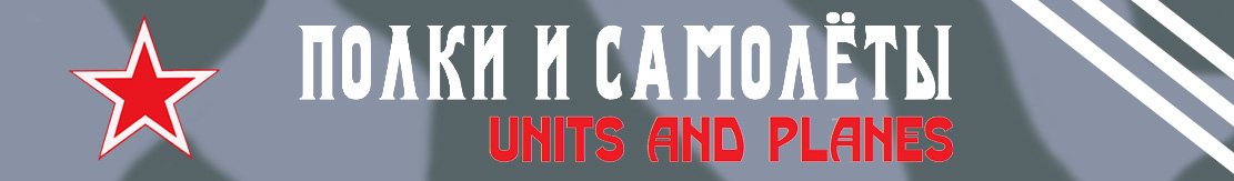 Regards Massimo |
|
|
|
|
Logged
|
|
|
|
|
66misos
|
|
« Reply #7 on: July 26, 2018, 04:51:45 PM » |
|
Hi,
and what about to start with black-green scheme 1/3 from the left and somewhere about the middle (1/3) the color continually changed to grey-grey 1/3 on the right side? And the same patterns for both black-green and grey-grey scheme. Red black-outlined (early war style) star on the left while red white+red+outlined star (late war style) on the right. No stripes. I am afraid that those 3 white lines look too much like Adidas.
Regards,
66misos
|
|
|
|
|
Logged
|
|
|
|
|
Massimo Tessitori
|
|
« Reply #8 on: July 27, 2018, 06:35:03 AM » |
|
Hi Misos,
unfortunatey I'm not in good health on these days, so I can't make works. Anyway I think that a background with too many colors could reduce the readabiity of the inscriprions.
Regards
Massimo
|
|
|
|
|
Logged
|
|
|
|
|
PG monster
|
|
« Reply #9 on: July 27, 2018, 07:00:28 AM » |
|
Hello. Massimo, great job! I'll back at next week and put it to the site, and we will see how it looks. And plz get well, we need you healphy! Can you send the source file, I'll try play with it in photoshop. Stripes are simple to experiments, I hope. Misos, your idea is interesting too. LOL, adidas! Too move from the yankee brand, we can replace the stripes color to red 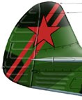 , or vertical direction  or 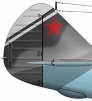 or 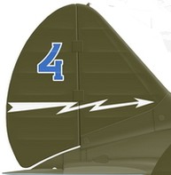 or 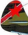 or  (used your, Massimo's, Bykov's, Kazakov's, Pavlygin's profiles) |
|
|
|
|
Logged
|
|
|
|
|
Massimo Tessitori
|
|
« Reply #10 on: July 29, 2018, 10:55:02 AM » |
|
Hi I've sent the file. Is it easy to rework?
Regards
Massimo
|
|
|
|
|
Logged
|
|
|
|
|
PG monster
|
|
« Reply #11 on: July 31, 2018, 07:56:27 AM » |
|
Yes, I got the file, thank you! Still havn't time to work on it. I've temporarily put your banner as is. http://ava.org.ru/It looks like I need to change the background image of the whole page too, hehe. |
|
|
|
« Last Edit: July 31, 2018, 07:58:24 AM by PG monster »
|
Logged
|
|
|
|
|
Massimo Tessitori
|
|
« Reply #12 on: July 31, 2018, 10:02:39 AM » |
|
Hi,
the page looks nice in this way. Why will you change the background?
Eventually, can I suggest a light blue riveted surface?
Regards
Massimo
|
|
|
|
|
Logged
|
|
|
|
|
PG monster
|
|
« Reply #13 on: August 03, 2018, 07:47:40 AM » |
|
Hi,
The crumpled paper background was discordant with the strict style of the new banner. I've changed it to the background as other pages of the site, so it looks better now.
The riveted surface can be more interesting, please show what you mean.
|
|
|
|
|
Logged
|
|
|
|
|
Massimo Tessitori
|
|
« Reply #14 on: August 03, 2018, 08:37:07 AM » |
|
Hi, I've made a first attempt. It is not good as a good skinner could do, but gives the idea. 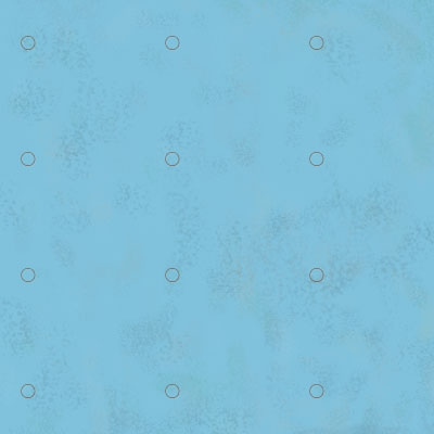 Regards Massimo |
|
|
|
|
Logged
|
|
|
|
|