|
KL
|
 |
« Reply #60 on: February 25, 2016, 09:02:40 PM » |
|
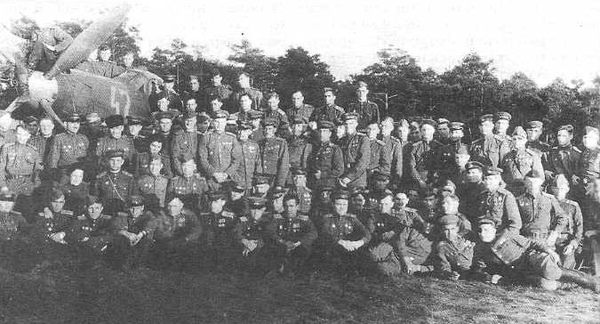 213 GIAP personnel in front of P-39Q-15 (yellow 47), which belonged to the regiment staff flight (command flight/section?). Dmitri Kalinin sits between the propeller blades. Germany, airfield Garo, June 1945. 213 GIAP personnel in front of P-39Q-15 (yellow 47), which belonged to the regiment staff flight (command flight/section?). Dmitri Kalinin sits between the propeller blades. Germany, airfield Garo, June 1945. ("Mir Aviatsiyi" magazine 2002-2, text about Dmitriy Andreevich Kalinin by V. Martinov)
There is no mention about b/n 47. Moreover, when I posted photo of the "47" at VIF, Alex replied: "Маленькая поправка: "47" - это тоже 212 Гв.ИАП" - A small correction: "47" - is also 212 Gv.IAP.
...P-39Q-15 (yellow 47)... AFAIK Q-15 had 3-blades propellers, not 4-blades.
Yes, the author Martinov misidentified P-39Q subtype and made up that part about the "yellow 47" being a regiment staff flight planeThe truth is that 212 giap and 213 giap shared same airfield in Germany in May-June 1945 and it happened that 213 giap personnel had been photographed in front of the 212 giap Airacobra...Photo is useful because it shows that spinner was different colour, i.e. lighter, than number 47. As an option, you may try yellow number and light blue spinner. As AIF experts have correctly pointed, the spinner colour should be the same for all 212 giap planes...  Regards, KL |
|
|
|
|
 Logged
|
|
|
|
|
66misos
|
|
« Reply #61 on: February 26, 2016, 06:55:41 AM » |
|
Hi KL,
no problem. I will make b/n 47 yellow while spinner will be kept light blue. But to follow the same logic, b/n 34 should be also yellow. And spinner with nose of the "yellow 44" should be also light blue (with red decorations)?
Regards,
66misos
|
|
|
|
|
Logged
|
|
|
|
|
KL
|
|
« Reply #62 on: February 26, 2016, 08:02:14 AM » |
|
Hi Misos, it looks that numbers had several colours in 1945: No 34 is the same colour as spinner (blue...?)  No 47 is darker than spinner (yellow...?) No 56 is white  No 43 is white  No 44 is yellow  Regards, KL |
|
|
|
|
Logged
|
|
|
|
|
KL
|
|
« Reply #63 on: February 26, 2016, 07:19:44 PM » |
|
Hi Misos, I am trying to see how blue spinner looked on b/w photos. Spinner tip on Normandie-Niemen Yaks was blue         On black-and-white photos, N-N spinner blue looks significantly darker than 212 giap spinners. If 212 giap spinners were blue, the blue colour must have been lighter "sky" blue, something like undersides AMT-7 "Goluboi". In theory, sky blue is not a "quick recognition colour" - it makes spinner "invisible" against blue sky, not distinctive... Regards, KL |
|
|
|
|
Logged
|
|
|
|
|
Troy Smith
|
|
« Reply #64 on: February 26, 2016, 07:46:02 PM » |
|
fascinating discussion, and a lot of good detective work and data collection. I've not posted anything as I have had nothing to add before. A couple of points about Konstantin's last post. Blue is a tricky colour on B/W film, use of filters or different film types can radically change the appearance of blue, as can be seen in the above pics, I've not seen Orthochromatic film used in Soveit photos, but this film type makes blue very pale, and yellow appear as black http://www.britmodeller.com/forums/index.php?/topic/234958226-colour-interpretation-of-bw-photos/I have thought of writing a brief note to clarify what types of photographic film in black and white were commonly used in the '30s and '40s, as there seems to be a lot of confusion about the subject: black and white films of the time were basically of three types , although the boundaries between these types were not always entirely clear-cut in practice:
- Ordinary or common film ( color-blind ) was sensitive to light in the blue spectrum, violet and ultraviolet, and besides being cheaper, it only required yellow -green or red light in the darkroom. Using this film the red and yellow tones in the final print looked very dark and the clouds of a blue sky tended to become invisible, blending into the background unless a filter was used.
- Orthochromatic films themselves, sensitive to the spectra blue, violet, ultraviolet, but also green and yellow in varying degrees depending on the quality and type. These films require dark red light in the development phase and while the yellow tones can be lighter in print than using colour-blind film, their hue varies depending on the quality of the emulsion and the processing, while red tones still appear dark, seen that the film is not sensitive to red light. They were often the preferred choice for portraits because of the good rendering of contrast.
- Panchromatic film, sensitive to blue, violet, ultraviolet, green, yellow and red, while translating the colors into shades of gray closer to the experience of the human eye, remained also variable in the results because of its quality, conservation status and the skill of those who developed it, and it required total darkness in the darkroom. This films, however, offered a reduced contrast compared to common and orthochromatic .
With all of these kinds of film the use of filters was very common: yellow and amber, in particular, often intended to diminish - with variable results - the effect of ultraviolet light, invisible to the eye but very visible on film, or to correct contrast and brightness of the final result . At the time the use of these filters was an integral part of the art of the photographer, and they were used very often.
The above is an extreme simplification of the technology available at the time, and there were in fact emulsions which came "halfway" between the types described, despite being advertised and sold as orthochromatic or panchromatic. The subject would deserve much more research and I am sure I have just scratched the surface of what we could find.
I hope that this may help a better understanding of how difficult – and indeed treacherous – the interpretation of colours from B/W prints can be.
This difficulty also partly affects colour emulsions of the time but I must confess I have not got around to finding out what the exact differences between – say - American and German film were.
Any corrections or additions to what I have written here are very welcome.
Flavio
also http://www.britmodeller.com/forums/index.php?/topic/234937019-pru-spitfire/Below are another two shots, also taken at about the same time, but presenting as dramatically different prints. The first appears to have been taken using the same camera set up as the three above. The second is dramatically different in its tonal values.   Both Orthochromatic and Panchromatic films are very sensitive to radiation with wavelengths of 350 to 450nm. This range covers from near ultra-violet to light blue. These give an abnormally high density image on the negative, resulting in an abnormally light-toned area on the print. The small difference in light intensity between the blue sky and white clouds is completely lost on the negative and, it is impossible to produce a print where clouds are visible. For this reason most photographers carried a Yellow filter in their kit. This filter reduces the amount of ultraviolet and blue light that reaches the negative, reducing the density of the image of the sky on the negative and, allowing it to print as a darker tone. The shorter the light wave length, i.e. the further into the UV spectrum the light is, the stronger the effect. I believe that, after taking the first shot, the photographer has whipped out his Yellow filter and taken another from the same position, a matter of seconds later. (Note that there has been little movement of the blokes around the aircraft). As can be seen the sky has been considerably darkened in tone, as intended, as has the Blue in the roundel. The Red has been lightened slightly in tone as would be expected. The dark blue of the ‘erk’s overalls also appears as a darker tone while the khaki clothing remains much the same. What is particularly interesting is that the tone of the fuselage paint has been rendered as a dramatically darker tone on the print. This would suggest that this paint is such that it has been formulated to strongly reflect light in the ultraviolet region. To me this makes sense for an aircraft flying at high altitude and, further, would also tend to suggest that this machine has been painted, not with a “common garden variety” paint from normal stocks but with a paint specially developed for PR aircraft. Now I have launched the cat into the pigeon cage, I will sit back and wait for comments from the photographic and paint experts out there. I know these re slightly off the main topic, but are worth considering as factors in the appearance of colours. for example, some of the NN plans blue tips appear very pale, some are dark, but they are most likely very similar in reality. Use of sky blue as a recognition measure? well, the RAF used Sky spinners for 4 years, a colour that blends in at a distance can still be used for as a quick identification marking at closer range. HTH T |
|
|
|
« Last Edit: February 26, 2016, 07:48:48 PM by Troy Smith »
|
Logged
|
|
|
|
|
66misos
|
|
« Reply #65 on: February 26, 2016, 07:54:01 PM » |
|
Hi, IMHO N-N spinners were painted by some sort of a bit darker "French" blue. However, on other VVS Cobras (30 giap, http://lend-lease.airforce.ru/english/photogallery/30giap/page_06.htm) blue spinners look quite light: - here blue spinner and yellow b/n 93: 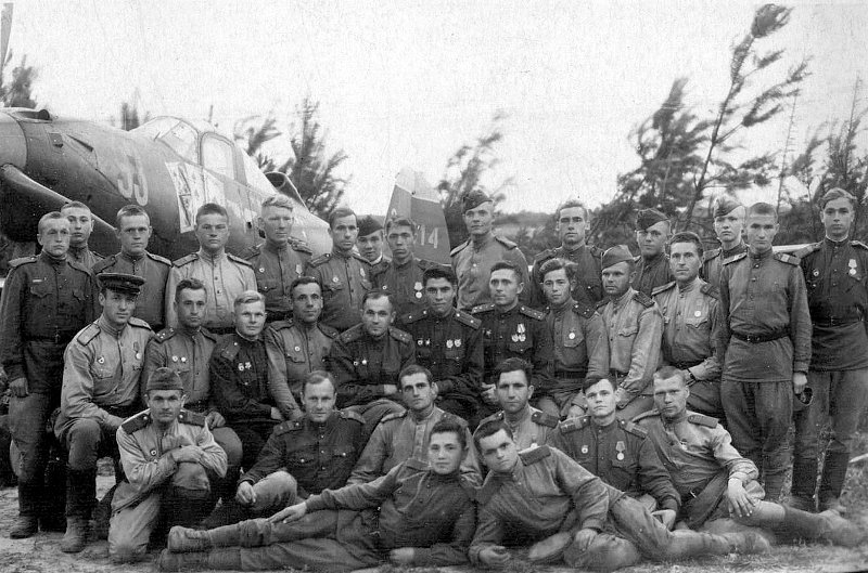   I do not say it had to be AMT-7, may be some "local custom mix" resulting in some light blue. May be even lightened AMT-7, which is quite dark. Regards, 66misos |
|
|
|
« Last Edit: February 26, 2016, 08:18:24 PM by 66misos »
|
Logged
|
|
|
|
|
KL
|
|
« Reply #66 on: February 27, 2016, 08:39:00 AM » |
|
|
|
|
|
|
Logged
|
|
|
|
|
Troy Smith
|
|
« Reply #67 on: February 27, 2016, 01:14:29 PM » |
|
Hi Konstantin the Spitfire in the comparison photos I posted is most likely not PRU Blue. PR Aircraft in the Middle and Far East were often in a darker blue colour, with lighter blue in the roundels. This was for the same reason that the RAF developed Azure Blue for underside use, as the tropical skies are a darker blue. http://www.britmodeller.com/forums/index.php?/topic/234944154-roundel-colour-in-royal-blue-pr-spitfires/There is a very interesting book on Photo Reconnaissance in the Far East called 'Eyes For The Phoenix' http://www.amazon.co.uk/Eyes-Phoenix-Photo-reconnaissance-Operations-South-East/dp/0951989944pdf's are floating around the web. despite it perhaps seeming a narrow area, it covers a lot, including some very useful colour information on Far East colour schemes in general and on various colour systems for describing colour. I'll add some more info later when I dig the book out. HTH T EDIT OK, here is a scan of a paint chip chart from a book on RAF colours 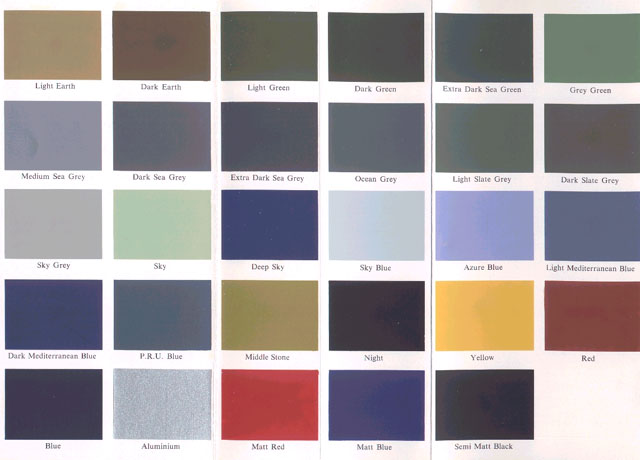 Note Dark Mediterranean Blue is one colours used on Middle East PR Spitfire, as was the mixed 'Royal' or 'Bosun' blue mentioned in the linked thread this is a Far East Hurricane in a dark blue colour, note the yellow rings around the wing roundels to make them stand out, as the roundel blue and uppers were similar/same colour.  from a lengthy thread here http://www.britmodeller.com/forums/index.php?/topic/234925271-pr-hurricane-colours-middle-east/I know off topic, but hope of interest. |
|
|
|
« Last Edit: February 27, 2016, 02:23:51 PM by Troy Smith »
|
Logged
|
|
|
|
|
Massimo Tessitori
|
|
« Reply #68 on: February 28, 2016, 12:20:07 AM » |
|
Hi I see that the paint of the spinner is as matt as the olive drab. This suggests that it was a paint intended for camouflage instead of markings. If it is stated that it was blue, A-28m or AMT-7 look likely. Regards Massimo |
|
|
|
|
Logged
|
|
|
|
|
66misos
|
|
« Reply #69 on: February 29, 2016, 06:14:43 AM » |
|
Hi, ... I will make b/n 47 yellow while spinner will be kept light blue. But to follow the same logic... spinner with nose of the "yellow 44" should be also light blue (with red decorations)?
Regards, 66misos |
|
|
|
« Last Edit: March 06, 2016, 09:01:59 AM by 66misos »
|
Logged
|
|
|
|
|
KL
|
|
« Reply #70 on: February 29, 2016, 08:30:22 PM » |
|
Hi Misos, "47" looks good, drawing may be considered as final!  You have to change comment: it can't be summer 1945 - by summer slogan probably disapeared and medals/orders appeared on doors. IMHO, the comment should be: P-39Q-25 212 giap, during Berlin Offensive operation (16 April ? 8 May 1945), Freiwaldau airfield, Silesia and Dabern airfield, Brandenburg, GermanySome of comments regarding "44": - there is no red line between the blue nose and the rest of the plane behind. It's just a panel line... - IMHO red cannon shroud and red around m.g. openings looks somewhat strange. Maybe black or dark gray... - I wouldn't insist on AMT-11 - maybe something that looks similar, real paint is unknown - "44" looks very glossy, same as Kozhevnikov's "43" - both planes were repainted with non-camouflage paints - in 213 giap text, Alex says that regiment received P-39Q-5 in autumn 1943 and then P-39Q-15 in spring 1944. Is "44" a P-39Q-5 ? - photos look post-war, my guess is second half of 1945 or 1946. At that time 212 giap was based at Stockerau military training grounds (it wasn't an airfield originally!). Comment for "44" should be: P-39Q-5, 212 giap, second half of 1945 or 1946, Stockerau, AustriaHTH, KL |
|
|
|
« Last Edit: February 29, 2016, 10:40:09 PM by KL »
|
Logged
|
|
|
|
|
66misos
|
|
« Reply #71 on: February 29, 2016, 09:26:07 PM » |
|
Hi KL,
I am a bit confused with (red) outline. They added it on side of diagonal stripe on the tail and around digits 44, although there was no outline previously on other Cobras.
They either needed to increase their (e.g. stripe and number 44) visibility in case they were light blue like nose, or outline had only decorative purpose - then it was OK also even around very good visible yellow stripe and number.
Then, if it was only about increasing visibility of the blue stripe and number, red decoration on the nose around the guns had really no sense.
But if red color had decorative purpose, I can imagine it even with red line sepparating "divisional" color from "protective" color on the nose very easily.
It was already old Cobra (missing vent between propeller and front leg), so it could be used only for training after end of war.
Regards,
66misos
|
|
|
|
|
Logged
|
|
|
|
|
KL
|
|
« Reply #72 on: February 29, 2016, 10:59:18 PM » |
|
Hi Misos,
there are some similarities between Kozhevnikov's "43" and "Yellow 44": both were over-painted overall, both are glossy (non-camouflage paint), both were photographed in Austria (Kozhevnikov's "43" in July 1945, "Yellow 44" later in 1945 or in 1946).
- "Yellow 44" had yellow tail stripe, maybe "white 43" also had yellow stripe?
Regards,
KL
|
|
|
|
|
Logged
|
|
|
|
|
66misos
|
|
« Reply #73 on: March 01, 2016, 06:38:58 AM » |
|
Hi KL, I would say tthat there is painted line. The whole Cobra was freshly repainted, no reasom for some dirty or grease in tha area to make just that panel ine so prominent. There are also other panel line almost invisible. Also "panel line" of gun compartment cover plate is almot not visible. Compare panek lines with this cleane "new" Cobra: 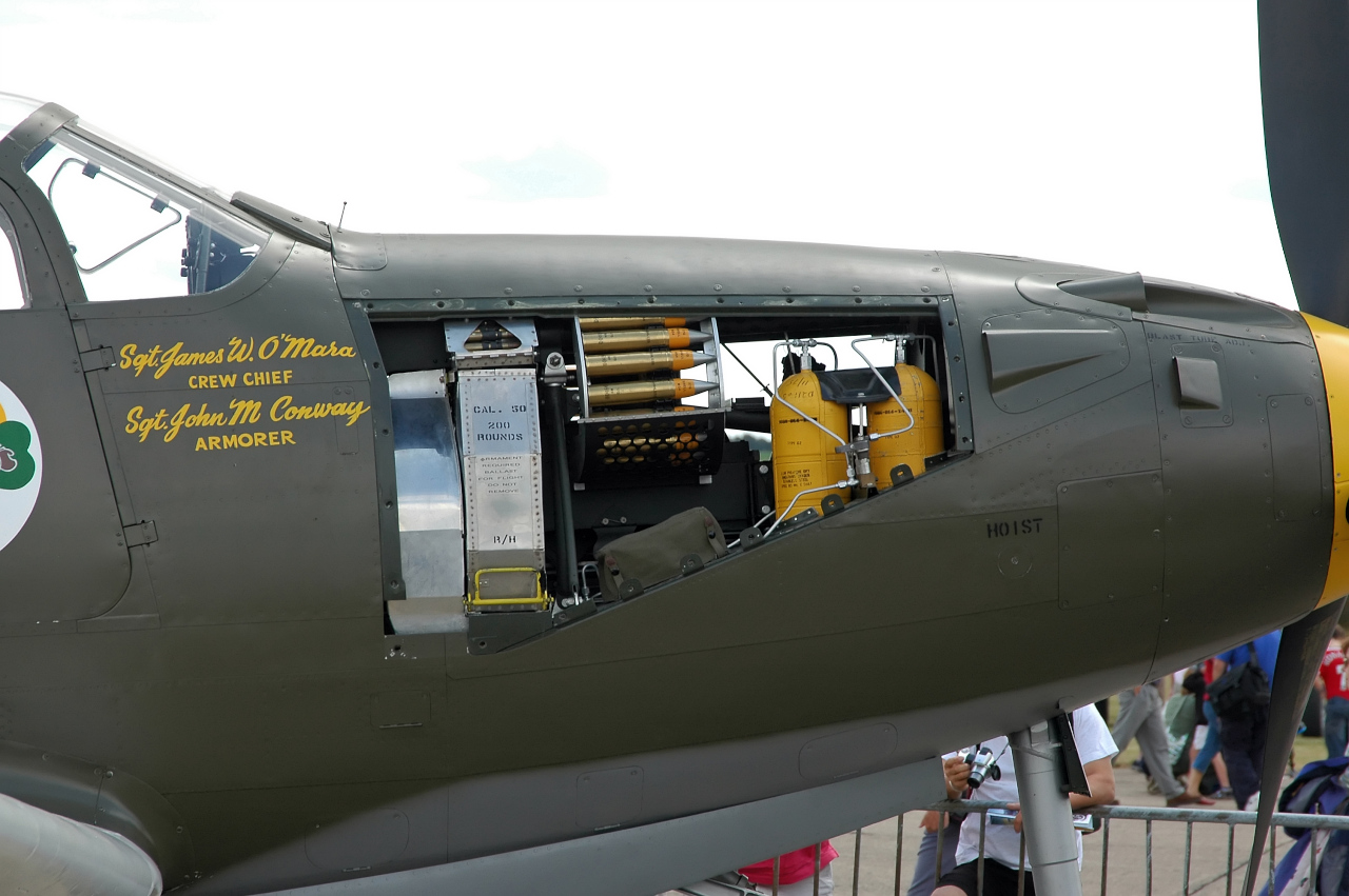  regards, 66misos |
|
|
|
|
Logged
|
|
|
|
|
KL
|
|
« Reply #74 on: March 01, 2016, 06:48:22 AM » |
|
Ok, maybe there is a thin line... it's thinner than red line under the number 44.
Cannon shroud and openings around machine guns are definitively painted. IMHO, black makes more sense - to hide blast stains.
Regards,
KL
|
|
|
|
|
Logged
|
|
|
|
|